Category
Verba volant, sed scripta manent (spoken words fly away, written words remain)
Entrant
Christine Bess Duvant
Entry
A scroll in place of a person
History:
I have only made a few scrolls and it is something I desperately want to be able to do more often, but as we all know, time and energy is not always on our side.
At Rowany Festival I was asked if when I got back to NZ, I could create a scroll for the Prince and Princess at their Coronation at Southron Guard that would take place very soon after in the Crescent Isles. This was in lieu of one of the Kingdom officers being there and would be presented at the time that they would have presented the documents of their office.
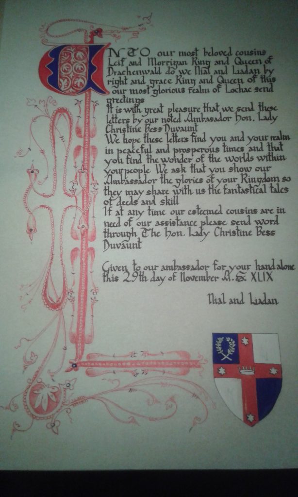
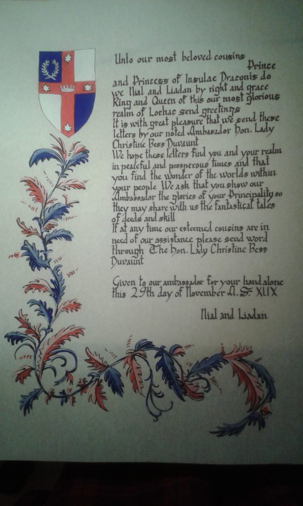
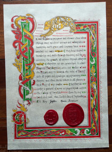
I had produced 3 scrolls to date with Calligraphy and Illumination. 2014 for the Prince and Princess of Insulae Draconis, another for the King and Queen of Drachenwald from our Crown in Lochac as a gift. The third in 2015 was my friend’s Pelican scroll. I had never tried Calligraphy or illumination before 2014 so there was a lot of trust in me for that. The information and research behind these can be found here
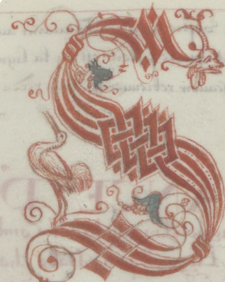
Like the scrolls above, I didn’t have much time to do the one for Coronation. I had seen a really cool style that my friend who is a Laurel in such things in Ireland had done, and due to the format I felt that I could probably make it happen in a short amount of time.
This scroll was also not something that I thought the Royals would treasure or keep, as it was more of a promissory note for the kingdom Officer from Terra Rosa that couldn’t attend the ceremony in Southron Guard. So while I wanted to make it look good, I was hoping with the limited time I had to make it that they wouldn’t look too closely!
I spent a few spare moments over a few days searching for extant images of the style that I thought I could do ‘quickly,’ and the kind of Calligraphy that matched it.
I made a pinterest page which can be found here (not everything on there is for the project – there is also stuff that I liked and have stored there for later.) The dates and information are on the pins there https://uk.pinterest.com/chantellegerrar/illumination/. For me, the main thing was that it was researched and of a mostly period style that was recognisable but could be done quickly.
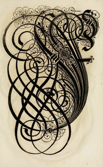
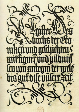
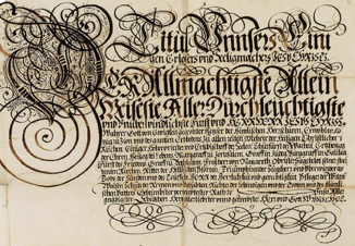
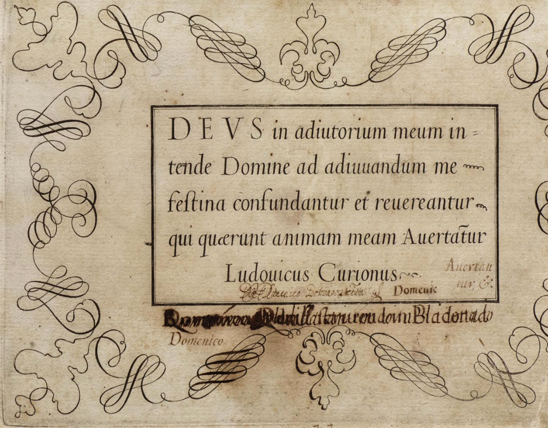
The scroll I chose to base it on is below
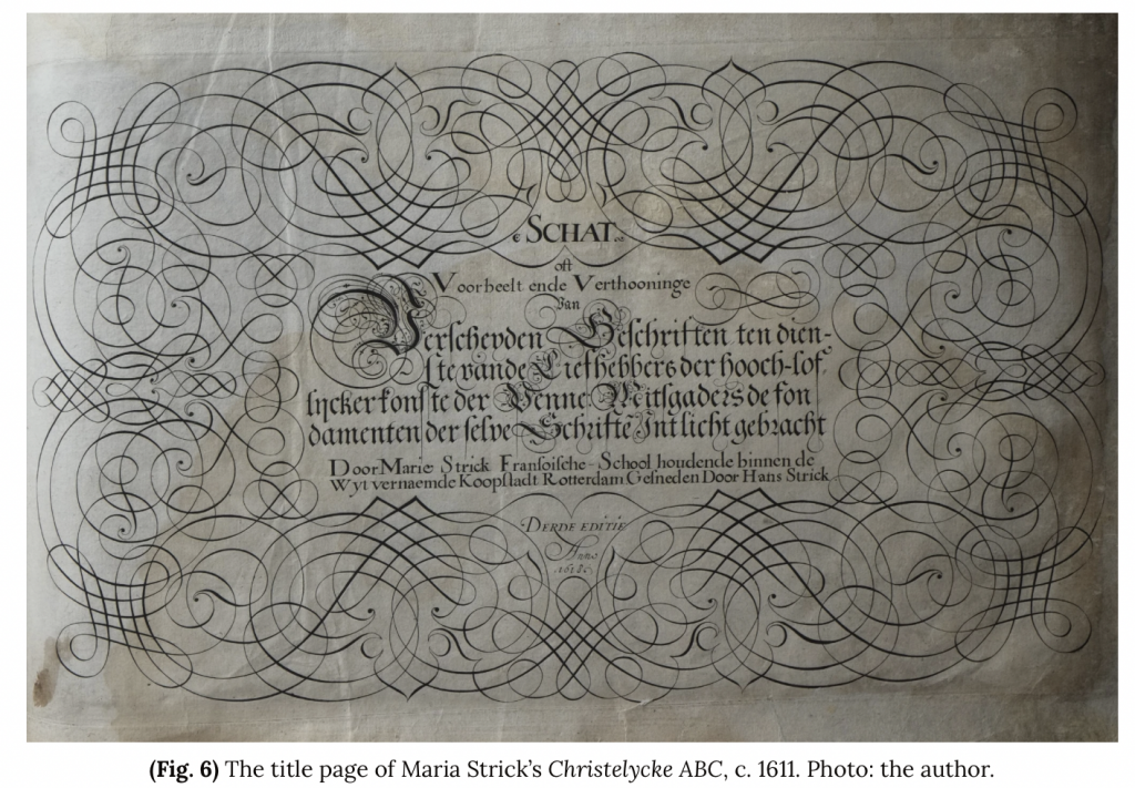
Kalligraphische Schriftvorlagen von Johann Hering zu Kulmbach – Johann Hering 1624-1634 (Bamberg).
“Johann Hering (?1580-1647) compiled his album of elaborate calligraphic letterforms, innovative type arrangements and traditional alphabets over a ten year period in the 1620s and 1630s in the Kulmbach region of Bavaria. (Or it was produced sometime during this time frame: it’s not clear)” http://bibliodyssey.blogspot.com/2012/01/calligraphy-letterform-album.html
More images of the book can be found here and it became available in the Bamberg State Library in 2013
http://digital.bib-bvb.de/view/bvb_mets/viewer.0.6.5.jsp?folder_id=0&dvs=1739667243889~291&pid=3041381&locale=en&usePid1=true&usePid2=true
I know that the work is slightly out of period, however, with limited resources and knowing that I had limited time, and knowing it would never be displayed or seen again, I checked with my friend over in ireland and she said it was a good style for quick things and the style can be found in the years preceding it. I chose this to model it on as I wanted something that would create an impact in court when shown/held up to the populace for all of about 2 seconds.
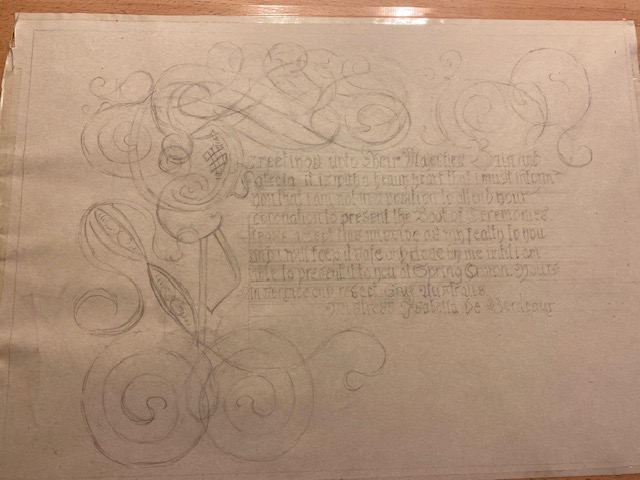
Having oscillated for a week over it all my time was running out. Should I do something ‘out of period?’ How could I afford the time for something that would take lots of time but be more ‘in period.’
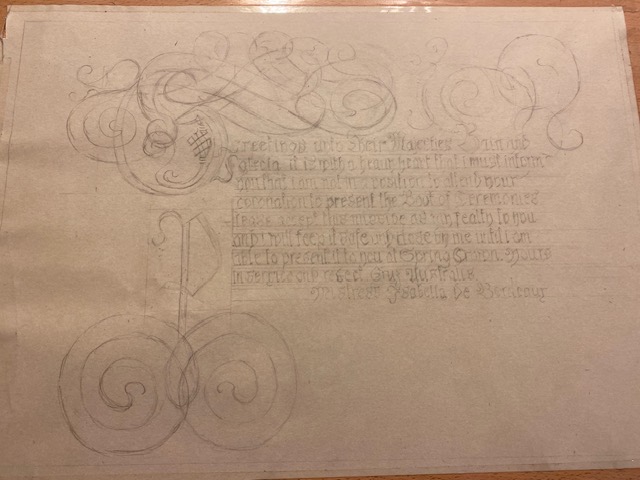
I bit the bullet as I couldn’t find anything else that would be able to be done without a lot of effort in the time frame of the approximately 4 hours that I had to actually make it the Friday night before going to Coronation early Saturday morning, and I had found images leading up to it in the late 1500’s and early 1600’s. I also wasn’t copying the image, I was just using the general idea behind it to make mine.
This was the result:
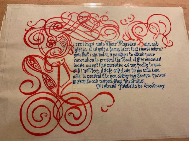
I know what I should have done differently – less fiddly bits on the actual text, taken more care and time with a finer nib, as well as taking more time and attention with it in general as well as more in-depth research.
While I wasn’t particularly happy with this project (with it being slightly out of date and the things cited above) I chose to put it into this competition to help those that might be afraid of judgement or afraid of trying something new and then revealing it and their mistakes etc, and to encourage people to not only try regardless of the outcome, but also to do things even if you ‘don’t think you have the time or energy,’ as I now have something that I want to improve on and try again and I know what I can do differently next time.
Hopefully that helps?
Ps – if you want a really cool website showing work from the 1500’s as well as the 1600’s https://pennavolans.com/16th-century-calligraphy/